
Reimagining Smokeball’s Communications Experience
Overview
At Smokeball, I worked on improving the end-to-end communication experience between law firms and their clients. This included redesigning the internal messaging experience used by firms inside Smokeball, as well as the external client portal where clients receive messages, documents, forms, invoices and event details.
Although these initiatives were explored as separate streams of work, they were closely connected. Together, they formed a broader communication ecosystem: firms needed a more efficient and intuitive way to send and manage communication, while clients needed a clearer, more accessible and less frustrating way to receive and act on it.
My role focused on simplifying both sides of that experience, aligning them to Smokeball’s evolving design system, and making secure digital communication feel more modern, intuitive and trustworthy.
My role
Senior Product Designer
I worked closely with product managers, engineers, stakeholders and internal subject matter experts to improve firm-to-client communication and increase adoption of Smokeball’s secure portal and messaging tools.
My work included:
discovery research
journey mapping and workflow analysis
competitive review
sketching and concept exploration
wireframing and prototyping
usability testing
visual design using the design system
collaboration with engineering on feasibility and implementation considerations
The challenge
Smokeball’s communication experience, referred to as ‘Communicate’, no longer reflected the quality or direction of the broader product.
On the firm side, the messaging experience felt cluttered, dated and inefficient. Conversations were difficult to manage, the interface created unnecessary cognitive load, and workflows did not align with how legal professionals naturally triaged and returned to messages throughout the day.
On the client side, the portal experience was similarly dated and confusing with clients struggling from login, to navigating the interface as well as understanding what they needed to do next. In addition, the portal needed to work seamlessly across desktop and mobile without relying on a separate app codebase.
The broader design challenge was to create a communication experience that was:
secure and professional
easier for firms to manage
easier for clients to understand
consistent with Smokeball’s new design system
responsive across devices
scalable without the maintenance burden of separate mobile products
Approach
I used a mix of qualitative research, internal insight gathering and iterative prototyping.
Research and discovery
I spoke with firms to understand day-to-day communication pain points
I gathered insight from internal SMEs, support staff and stakeholders
Used internal feedback channels and tools such as Twine to capture recurring themes
Mapped current journeys and workflows to identify friction points
Reviewed competitors and adjacent products for patterns and opportunities
For the client portal specifically, direct access to end clients was limited, as firms were understandably cautious about involving clients in research during legal matters. To address this, I implemented a feedback funnel within the client portal experience and monitored the responses to gather real-world insight over time.
Design process
I began by mapping the current-state experience and identifying where confusion, friction and cognitive overload were occurring. From there I worked through:
early sketches and black-and-white wireframes
mobile-first thinking for the portal experience
low to high-fidelity prototypes
usability testing of interaction patterns, IA and language
close collaboration with engineering to balance usability, security and technical constraints
project 1:
Client Portal Experience
The problem
On the client side, the portal was intended to be a secure place for clients to receive messages, documents, forms, invoices and event details from their law firm. However, the experience felt tired, inconsistent and difficult to navigate.
Clients often did not know:
what to do next
what was most important
where to find what had been sent to them
how to manage multiple matters clearly
There was also friction caused by account creation and password requirements, particularly for less tech-confident users. At the same time, Smokeball needed a solution that worked effectively across desktop and mobile without the ongoing overhead of maintaining a separate mobile app.
The solution
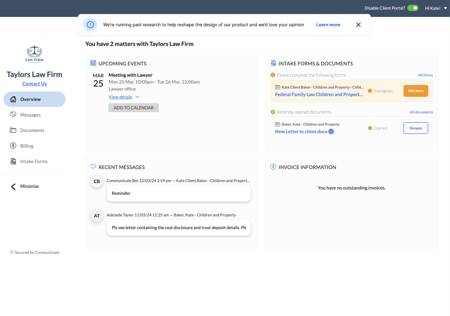
I redesigned the client portal as a modern, browser-based, responsive experience that made actions clearer and reduced barriers to entry.
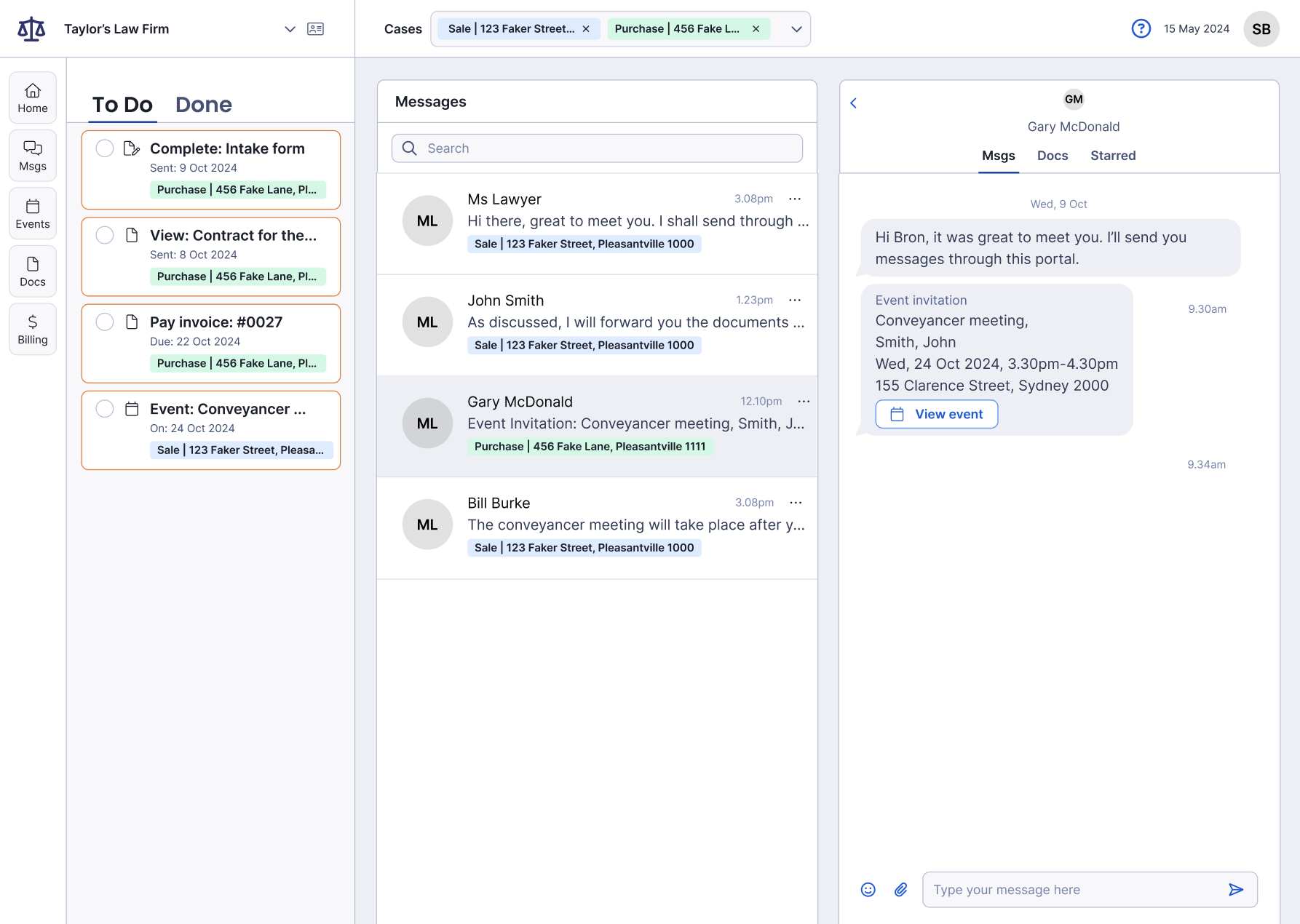
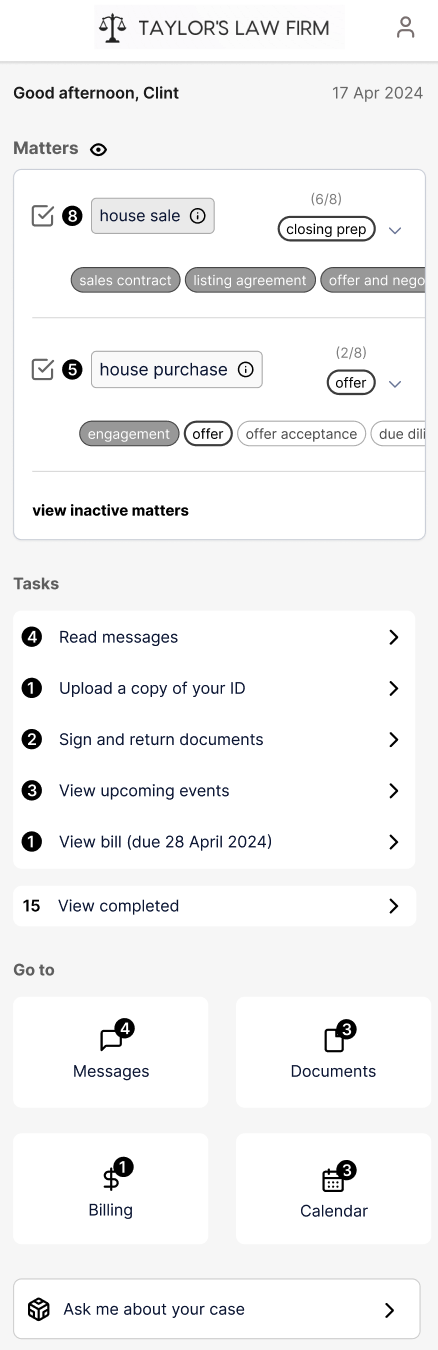
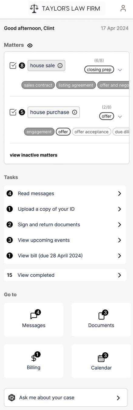
The core concept was a To Do-based portal experience that brought structure and visibility to everything a client needed to complete.
This included:
a clear task-oriented homepage showing what needed attention
direct pathways to read messages, complete forms, review/sign documents and pay invoices
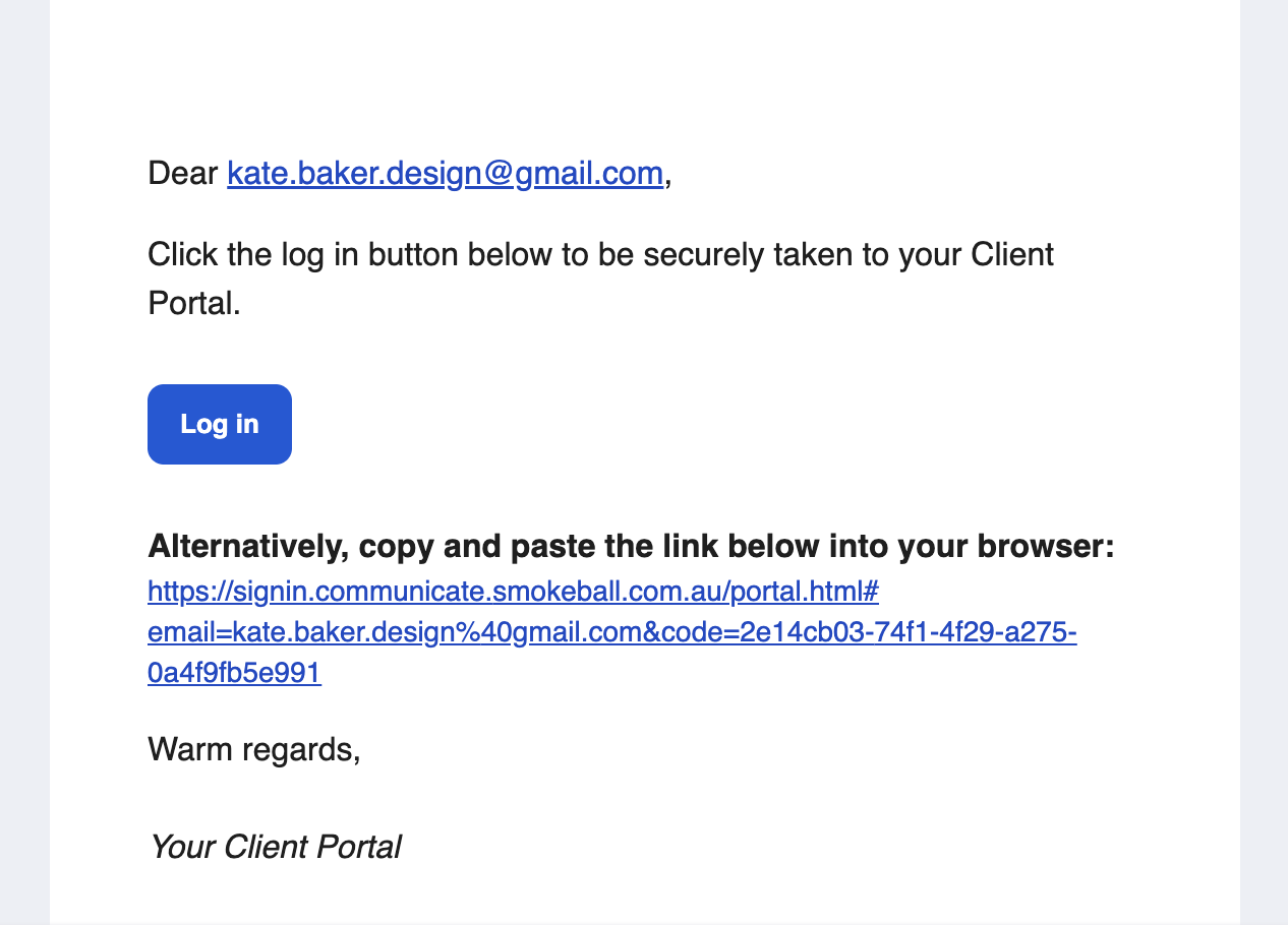
secure access via a unique email link rather than requiring a traditional username and password
clearer due dates and task visibility to help clients stay on top of their matter
support for multiple matters, with the ability to filter between them
access to events and calendar items, with reminders and diary integration
a more intuitive, responsive web experience across desktop and mobile
branding customisation to better reflect each firm’s identity and build trust with clients
Outcome
The redesigned client portal helped make the experience feel:
clearer
more intuitive
more accessible
more consistent with the Smokeball brand
easier for firms to encourage clients to use
The shift to a browser-based responsive experience also supported product scalability by reducing reliance on a separate mobile application, while still giving clients a simple and secure way to engage with their lawyer online.
Most importantly, the portal better reflected the real jobs clients were trying to do: understand what is happening, know what to do next, and complete tasks with confidence.
Impact
Across both workstreams, this work helped modernise a core part of Smokeball’s ecosystem and strengthened the end-to-end communication experience between firms and clients.
The overall impact included:
a more cohesive and modern product experience
reduced friction for clients accessing secure communications
clearer prioritisation and workflow management for firms
improved consistency through the use of the design system
stronger alignment between business needs, user needs and technical constraints
a communication experience that felt more intuitive, trustworthy and scalable
Project 2:
Firm Messaging Experience
The problem
Firms needed a secure and reliable way to communicate with clients and colleagues from within Smokeball matters, but the existing messaging experience felt outdated and difficult to manage.
The inbox in particular created friction with:
long, overwhelming message lists
unclear hierarchy and grouping
messages jumping between sections once opened
difficulty returning to conversations later
limited formatting, making messages feel less usable for more formal communication
no threaded replies, forcing users to manually reconstruct context
low understanding of the benefit of features such as Channels
a cluttered UI that did not reflect the new Smokeball design direction
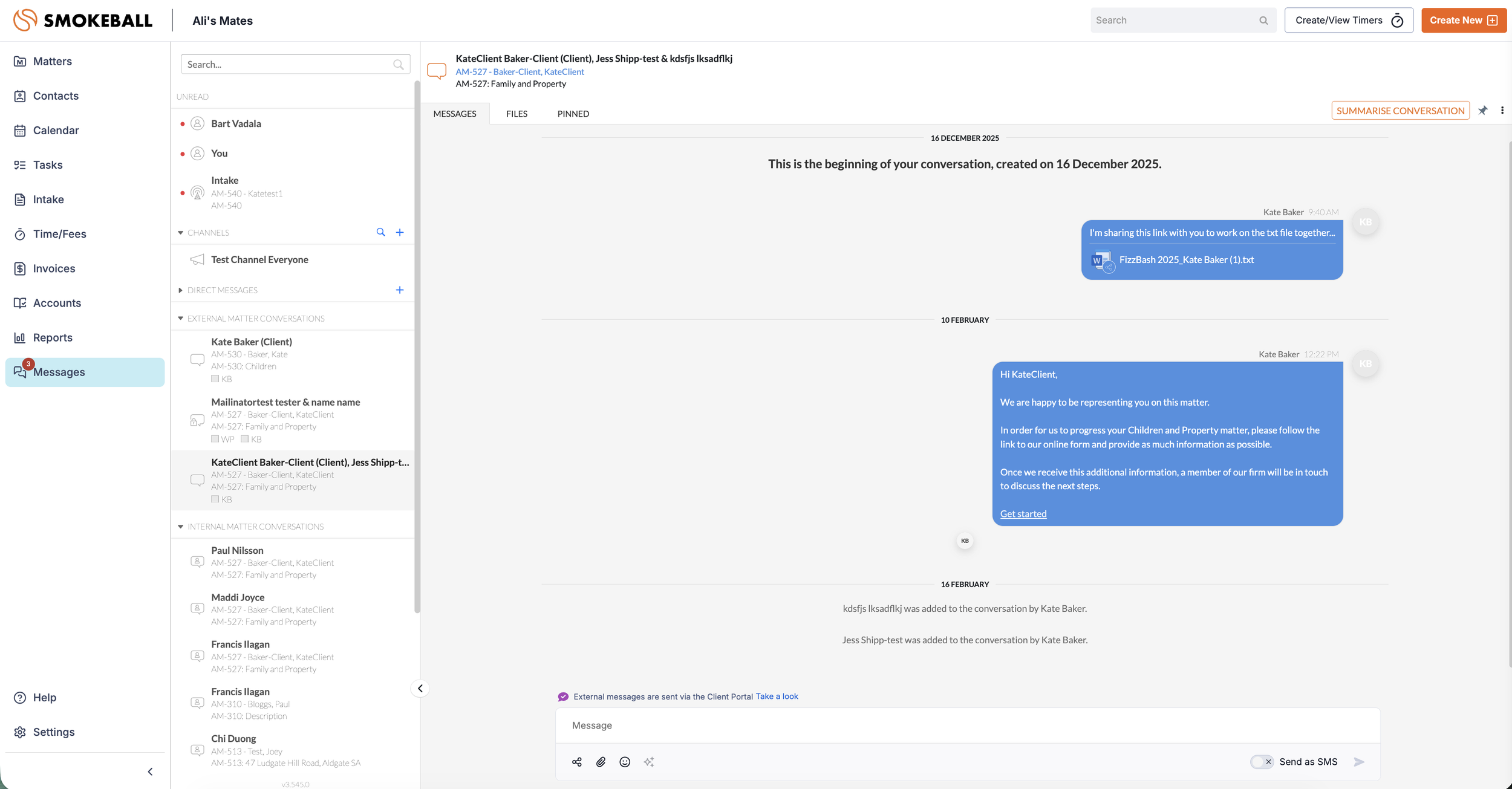
An almost comical AHA moment… Firms were repeatedly asking for ‘More pins’ via the support desk. Had we just given them what they asked for we wouldn’t have solved the right problem. Turned out, after researching further, they actually needed a way to mark conversations for follow-up after an initial morning triage. This was less about permanent prioritisation and more about managing attention… solved with the simple: ‘Mark as unread’ functionality.
The solution
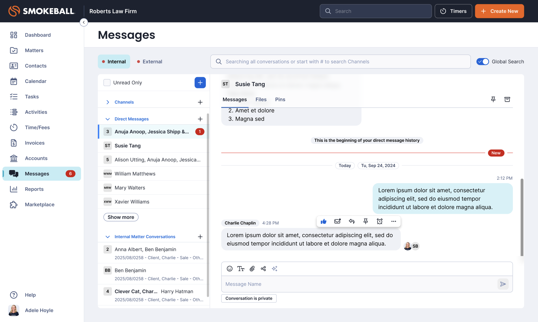
I redesigned the messaging experience using Smokeball’s design system and focused on improving clarity, triage and usability.
Key improvements included:
Separating Internal and External messaging into clearer tabs
Reducing cognitive load by simplifying message list organisation
Removing archived conversations from the main conversation list
Introducing the ability to mark conversations as unread for follow-up
Adding threaded replies so context could be preserved within conversations
Introducing a lightweight like/reaction feature so users could acknowledge messages without sending a formal reply
Adding a formatting toolbar with options such as bold, italics, underline, lists, strikethrough and links
Using tooltips and in-product guidance to better explain features such as Channels
Outcome
The redesigned messaging experience was received very positively by firms and internal stakeholders.
The work helped create:
A cleaner, more modern interface
Easier day-to-day message triage
Better support for how legal professionals actually work
More flexible and email-like communication when needed
Clearer understanding of messaging features
A stronger visual and interaction alignment with the wider Smokeball platform