
Enhancing User Experience for Fat Zebra's iFrame: A Comprehensive UX Case Study
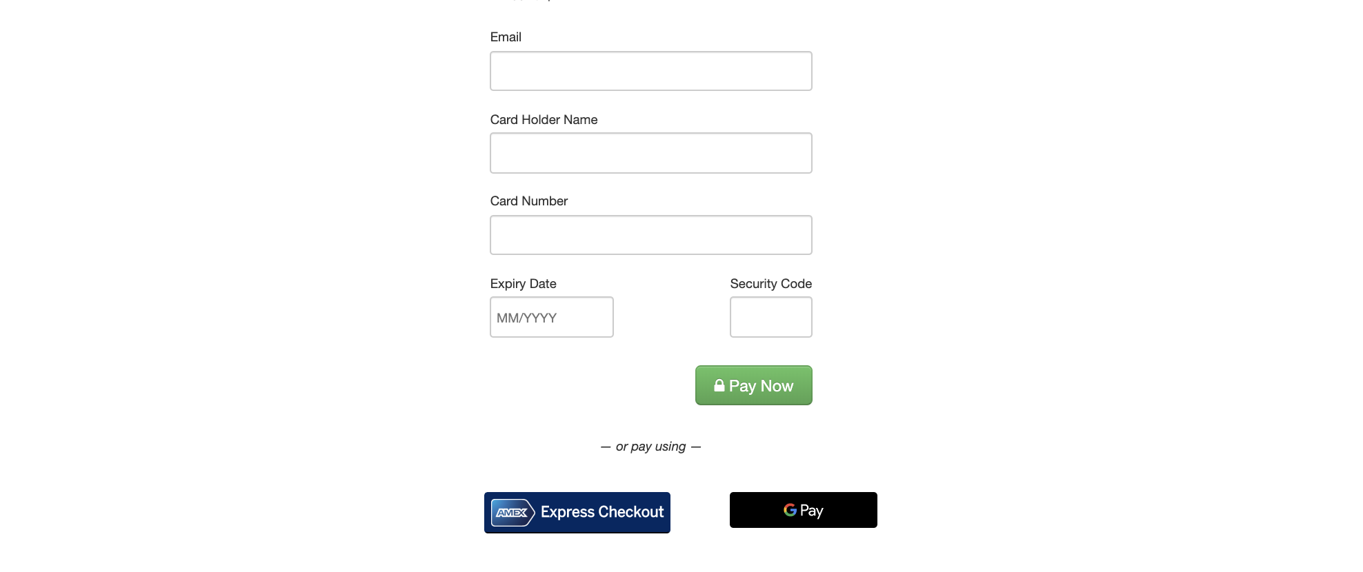
Background and problems
Fat Zebra's iFrame, a critical offering, prompted a quest for improvement within the team.
The founder's vision was to elevate the iFrame to the best in the market, incorporating new technologies to enable intelligent choices based on individual customer preferences.
Simultaneously, the development of a customized iFrame for a specific client raised the question of its potential broader applicability, given the considerable resources invested.
My role
Understanding personas
Outlining the customer journey
Identifying risky assumptions
This involved internal and external stakeholder interviews, interval stakeholder interviews, and external customer interviews to validate or invalidate assumptions.
Customer Journey:
Sales journeys took 1-2 weeks, with partnerships and banks facilitating introductions.
Documentation and sample codes were provided during the sales process.
Technical demos and questions, especially related to various payment methods, were handled by the support team.
Follow-up after integration lacked a special touch.
Who are the Fat Zebra customers
CFO / CTO - decision makers as to implementation
Developers - implementing the solution
E-commerce Manager
All industries
Negative Learnings:
Loss of customers to competitors like Braintree due to unclear product information and lack of demos.
Customer confusion about the product, mobile experience, SDK availability, and 3D Secure 2.0.
Limited use of Visa Checkout and Masterpass.
Tech documentation was perceived as bare-bones, impacting user experience.
Positive Learnings:
Customers valued Fat Zebra for PCI compliance, integrated fraud solutions, excellent support, and reporting APIs.
Drivers for using the iFrame included the replacement of legacy solutions, integrated fraud solutions, and robust support.
Key features like Google and Apple Pay, tokenization, and future APM integrations were in demand.
Competitors
Braintree (best), Stripe, & Adyen are biggest competitors
Worldpay
Internal insights
Documentation is only 'bare bones' and needs a rewrite
Easy to integrate :)
Customer insights highlighted the significance of PCI compliance, cost, support, security, and Service Level Agreements (SLAs) in their decision-making process. While the iFrame was perceived as basic but functional, documentation required an overhaul.
Merchants consider/research building their own iframe before realising cost/complexities
PCI compliance - main driver
Cost / Commercial viability is top reason after PCI/robustness when deciding
SLAs are important to merchants so they can uphold standards
Look and feel is important, but other factors are more so
Support is v important as it reflects on their service/business
Current documentation is confusing unless you examine it in depth (also clarified by Esther)
Decision makers in choosing an iframe vary across CTO, dev team, team leads, security
Always did competitive research - looking at APIs / documentation / demos. (Braintree, Stripe, Paypal were main competitors)
Our iframe is seen as basic but good enough "it works"
Reporting - important but seen as a separate bigger product potentially
External Customer Interviews:
Goal-oriented interviews revealed that functionality, cost, and support were primary reasons for choosing iFrames.
The documentation needed improvement for better user understanding.
Quick fixes were identified, emphasising the importance of a user-focused documentation review.
Defining Quotes:
"Our iFrame is basic but good enough."
"Documentation needs to be reviewed and made more user-focused."
"Iframes are chosen for functionality, commercial viability, and support."
Wants:
User-focused documentation to reduce support calls.
Ability to scan credit cards to prefill number.
Documentation split into different sections.
Clearer examples of API calls and remunerations.
Information phrased as questions for ease of understanding.
Pre-population of fields for customers.
Conclusion:
The iFrame, while basic, met essential criteria for functionality and commercial viability.
Documentation, perceived as confusing, needed a user-focused revamp. Insights into customer preferences, decision-makers, and competitors formed the basis for strategic improvements.
The need for pre-population of fields, better documentation organization, and a seamless user experience emerged as key considerations.
This comprehensive UX case study serves as a roadmap for enhancing Fat Zebra's iFrame, ensuring that user experience aligns with industry standards and customer expectations. The identified areas for improvement pave the way for a more streamlined, user-friendly, and competitive product.